
At its core Community Health Maps (CHM) has always been a citizen science project. Since the beginning the most used and accessible component is community data collection. This is arguably the most important component as well. The foundation of any mapping project is data. While the world is awash in data, most of it is produced by federal and state agencies and importantly is not created at the community scale. After several years of teaching CHM workshops, one thing that is abundantly clear is that communities often know the issues affecting their public health better than anyone coming from the outside. With CHM, communities can gather data on these issues via the citizenry. CHM also allows agencies and NGO’s to leverage communities to crowd-source local data.What makes Community Health Maps so effective is the workflow based in open source and low cost software. This allows Community Health Maps to be scalable across neighborhoods, counties and larger regions. The technology is accessible because of the low cost of entry. QGIS is open source and free of licensing fees. Fulcrum has a very reasonable subscription rate. The tools used are also intuitive. This has allowed CHM to go into communities and train the local citizens in data collection in just a few short hours.
Pilot Projects
During the spring and summer of 2013 the first two CHM pilot projects immediately demonstrated this citizen science potential:
The Urban Indian Health Institute in Seattle, Washington used the CHM workflow in what is still one of the more creative applications: mapping noise in American Indian communities in Seattle. Noise pollution is an environmental health concern that has been linked to a variety of health conditions in both occupational and community studies. It is easy to measure with portable devices. One of the goals of this pilot was to evaluate the scalability of the workflow to the larger Urban Indian Health Organization (UIHO) The conclusion was the approach was ideal for crowd-sourcing data across the UIHO network.
Field Training
Papa Ola Lokahi with the Native Hawaiian and the Indigenous Health Office of Public Health Studies, University of Hawai’i Manoa used CHM to conduct windshield surveys of obesity factors in six Native Hawaiian communities.

Both of these pilot project implemented the train-the-trainer methodology. This allowed us to train community leaders, who in turn trained members of the community to collect the data.
Miami King Tides
The most recent and applied use of the CHM workflow in a crowd-sourcing effort took place in Miami in 2017. This is the most disaster-specific project CHM has undertaken and is still engaged in - the mapping of King Tides in Miami. King Tides is a term coined to refer to the highest tides of the year. They tend to come in the fall.
Researchers at Florida International University had already developed a data collection protocol involving data on water depth, salinity, and bacterial contamination. However, they lacked a workflow that would allow the results to be mapped. Plus the existing methodology made participation of the local community too complicated.

King Tide Data Collection Kit
The training was in two tiers. We first showed two professors at Florida International Universities Wetland Ecosystems Research Lab how to rebuild their data collection form in Fulcrum. We also obtained a Fulcrum Community grant making it even easier to have community members participate. Community leaders and residents were then trained in the data collection protocol and use of Fulcrum.

Miami Community Data Collection
The coalition of mappers included: Unitarian Universalist Justice Florida (UUJF), which coordinated the neighborhood program, along with New Florida Majority and Quaker Earth Care program. Jan Booher with UUJF documented the entire event on her ReACT Tool Kit blog.
A powerful component of a project like this is that local citizens are empowered. They can see what data is collected and how. Plus they have ownership in it. They are collecting data in their front yards, parks their children play in and streets they drive through daily. Their local knowledge improves the resulting data. Often they knew of specific locations where flooding was worst that should be captured. These locales would have otherwise been overlooked.
“Data gives people a window into low-income communities that they wouldn’t otherwise have,” Booher said. “People have confidence in data and can use and share it—even people who cannot articulate information can advocate for themselves. This process can give people a voice.”
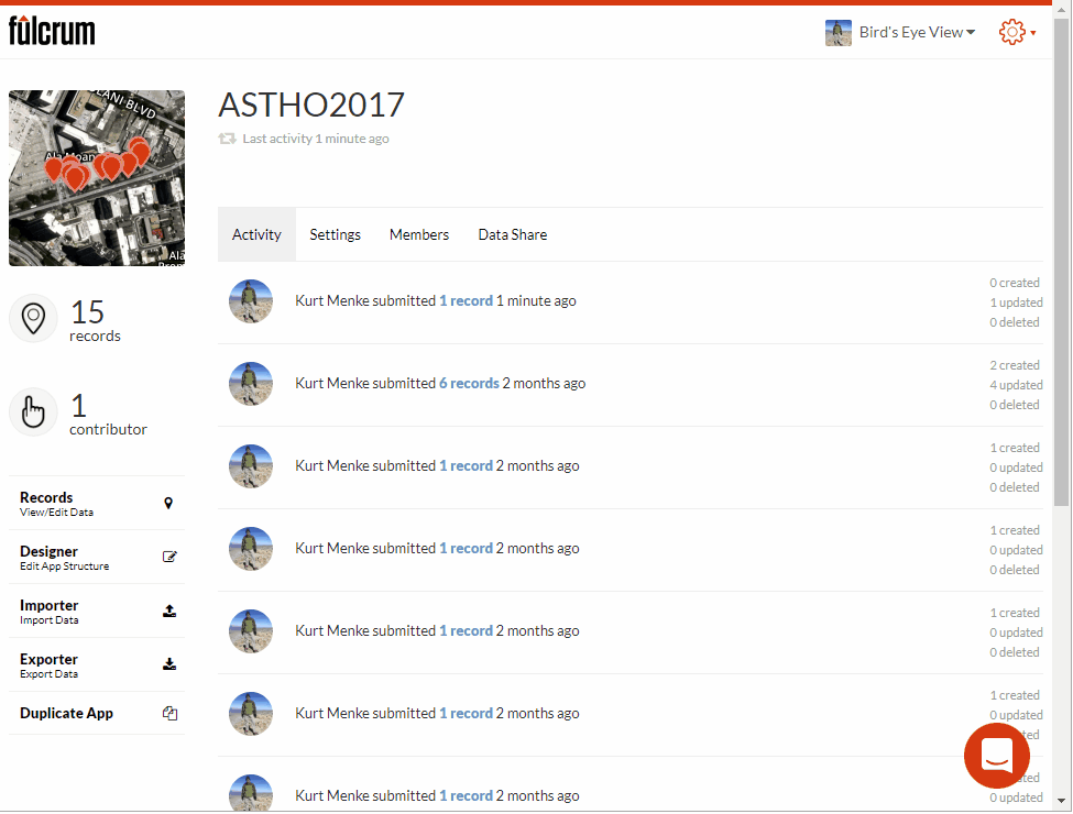
This CHM data collection now happens annually and is available as open data via the Fulcrum Community page. This data allows people to create valuable maps which communities and academics alike can use to convey the situation to decision makers.
Booher added, “Maps have a way of communicating in a dispassionate way that is fact-based.”

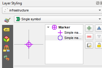
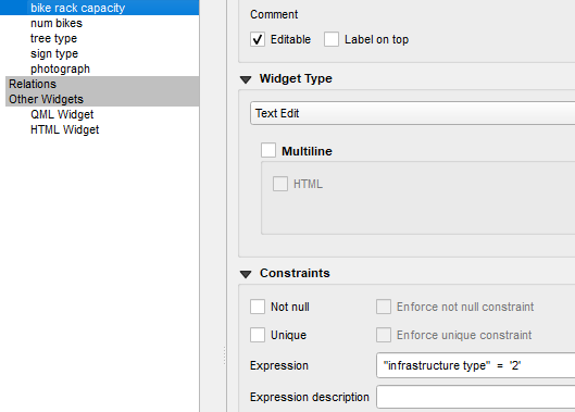
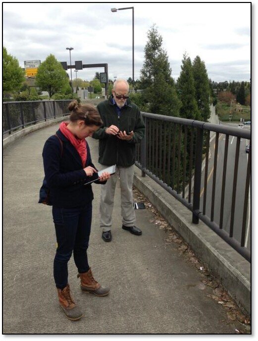
 When you are ready to collect a point, click the Record button and then the Add Point button. The form will open allowing you to collect all the data for that feature including a photograph. The points which have a condition preventing them from being entered will be unavailable and red. For example, the animation below shows a Stop sign being collected. The fields related to other things (bike racks and trees) are unavailable because a condition has been set within QGIS. Once the information has been entered simple click Save and move to the next data collection point.
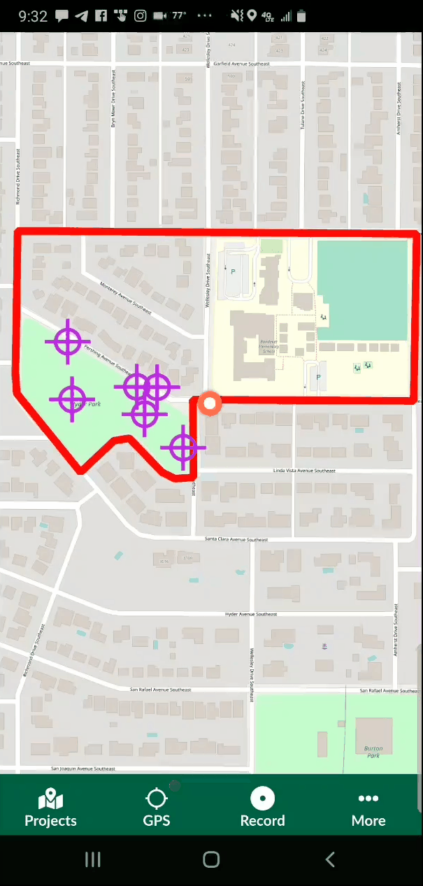
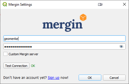
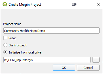
 You can then open the updated project from the same Mergin provider and begin to work with your data!
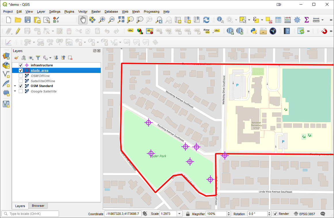 This is still a very new app but shows immense promise for Community Health Mappers. I encourage Android users to try it out. iOS users stay tuned for future developments.
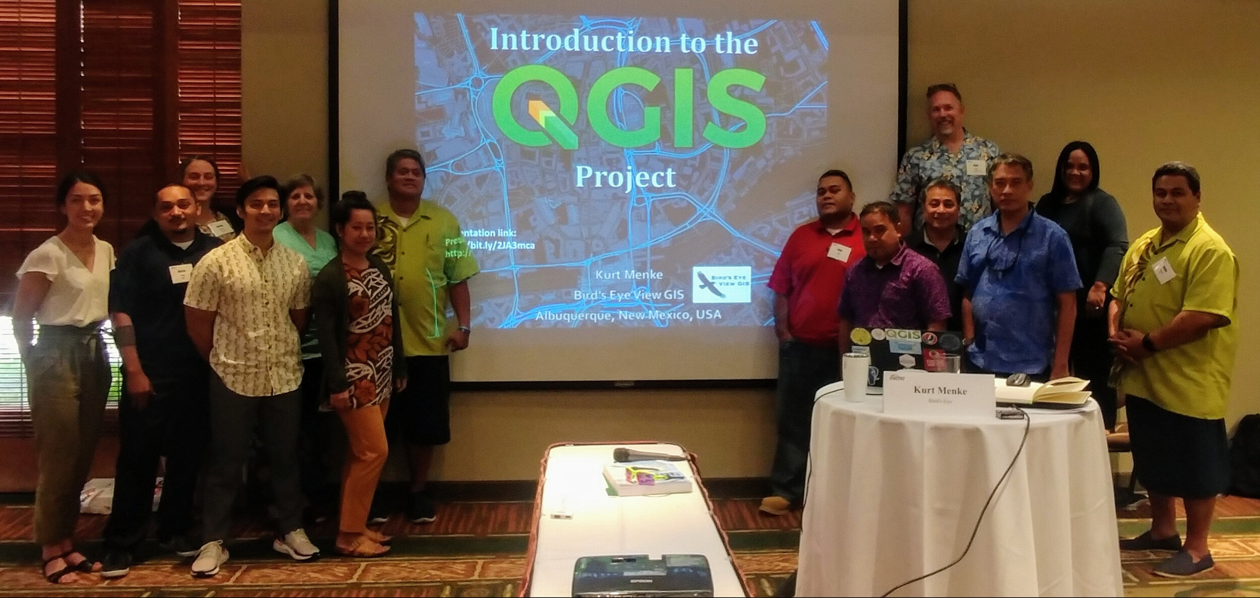 On June 8 & 9, 2019, twelve pacific island public health professionals met in Honolulu, HI to participate in a Community Health Maps training specifically designed to demonstrate how to collect and work with geographic data related to vector borne diseases, i.e. those that are transmitted to humans via other animals such as mosquitoes. Attendees represented: American Samoa, the Federated States of Micronesia, Guam, the Commonwealth of the Northern Mariana Islands, the Republic of the Marshall Islands and the Republic of Palau.This was the first of two, two-day, workshops aimed specifically at tackling the spread of diseases like Dengue fever, West Nile and Zika viruses. It was a team effort. The training was organized by the Association of State and Territorial Health Officials (
 conference site using
 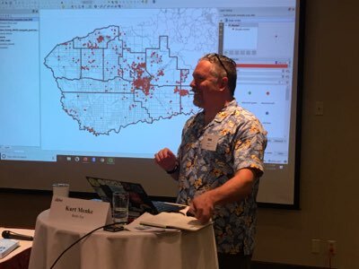 The second day focused on generating vector borne disease surveillance products. Kurt Menke developed a curriculum to demonstrate how a GIS can create maps and statistical charts that transform simple text and numbers in a database into intuitive graphics that communicate information quickly and accurately.
 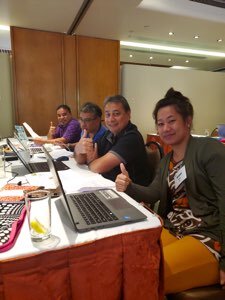 The attendees had a wide range of GIS skills from introductory to advanced capabilities. We experienced many of the common technical difficulties when working in a hotel conference room, older and newer computers and variations with different operating systems (Windows and Macs) as well. Despite all the differences, all of the participants: A) collected data with their smartphones, B) exported their data to a desktop GIS, C) used prepared data to create geographically accurate statistics, D) generated heatmaps of mosquito populations, E) calculated the minimum infection rate per year for West Nile and St. Louis Encephalitis viruses, F) identified potential sources using buffer operations with distances specific species are know to be able to travel, G) identified parcels at risk due to their proximity to a fictional outbreak of Dengue Fever and H) generated trend graphs of mosquito populations through time via the QGIS Data Plotly plugin. All participants received official
 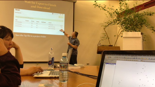 At three hours the workshop was slightly shorter than normal. This allowed us to focus on field data collection with
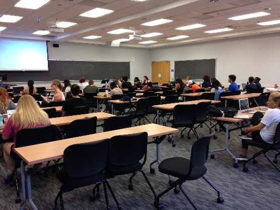
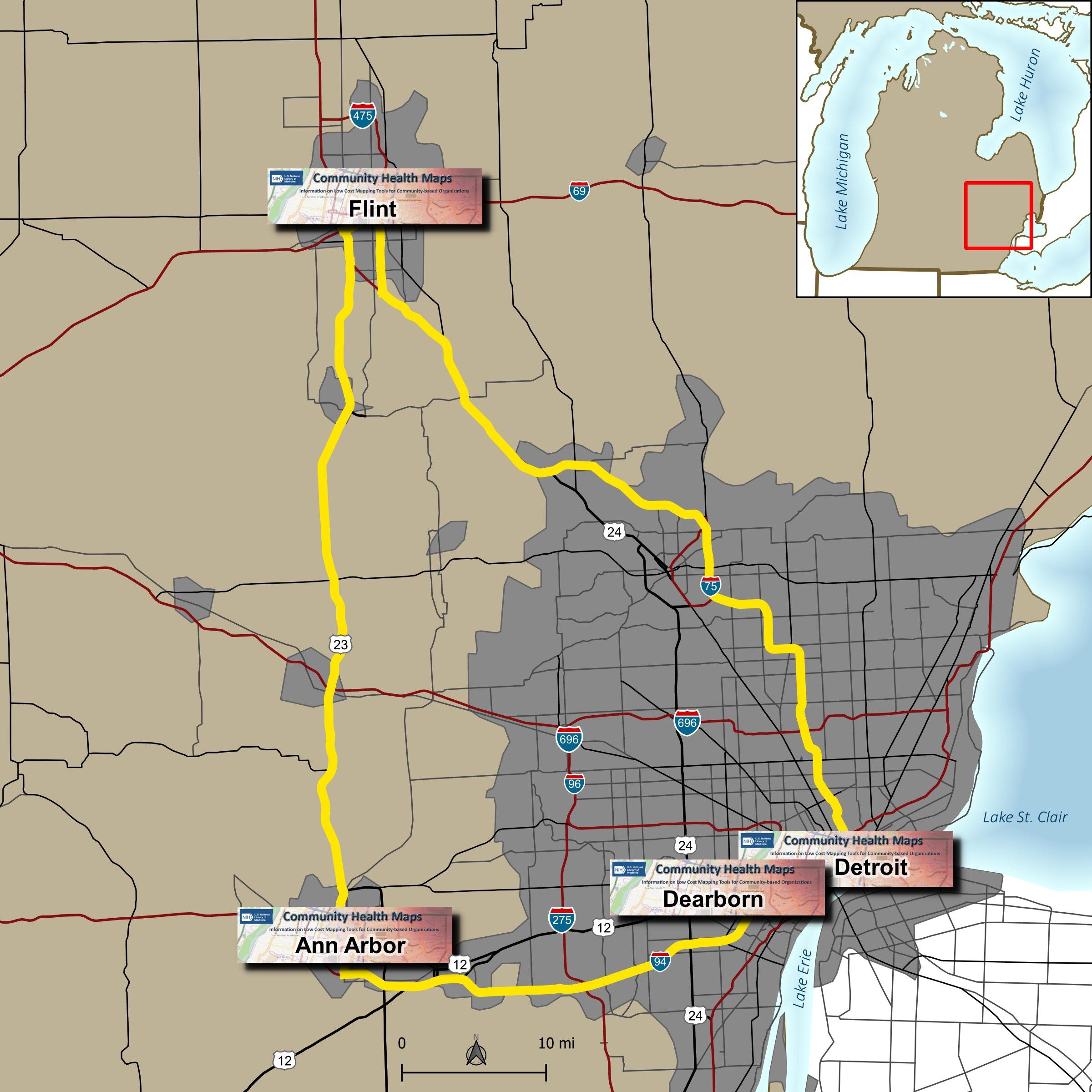 Due to great outreach by the University of Michigan team of - Tyler Nix, Marisa Conte, Alexa Rivera, Justin Schell, Sara McDonnell, Troy Rosencrants, Kui-Bin Im and Claudia Walters - the workshops had great attendance and ran like clockwork.The first was held at the University of Michigan - Ann Arbor at the Hatcher Graduate
  The second was held the following day at the UM Flint. We started in the University Center Happenings Room and moved to Thompson Library for the afternoon QGIS session. Forty five people came out for
 The third was held at the UM Detroit Center on April 4th. Thirty people registered for this workshop. This was probably the most diverse group including some UM faculty, plus Wayne State faculty, county public health staff (including some as far away as Saginaw County) and non-profit public health workers.
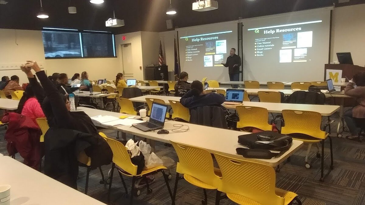 The fourth was held at UM Dearborn on April 5th. This was the smallest of the fo
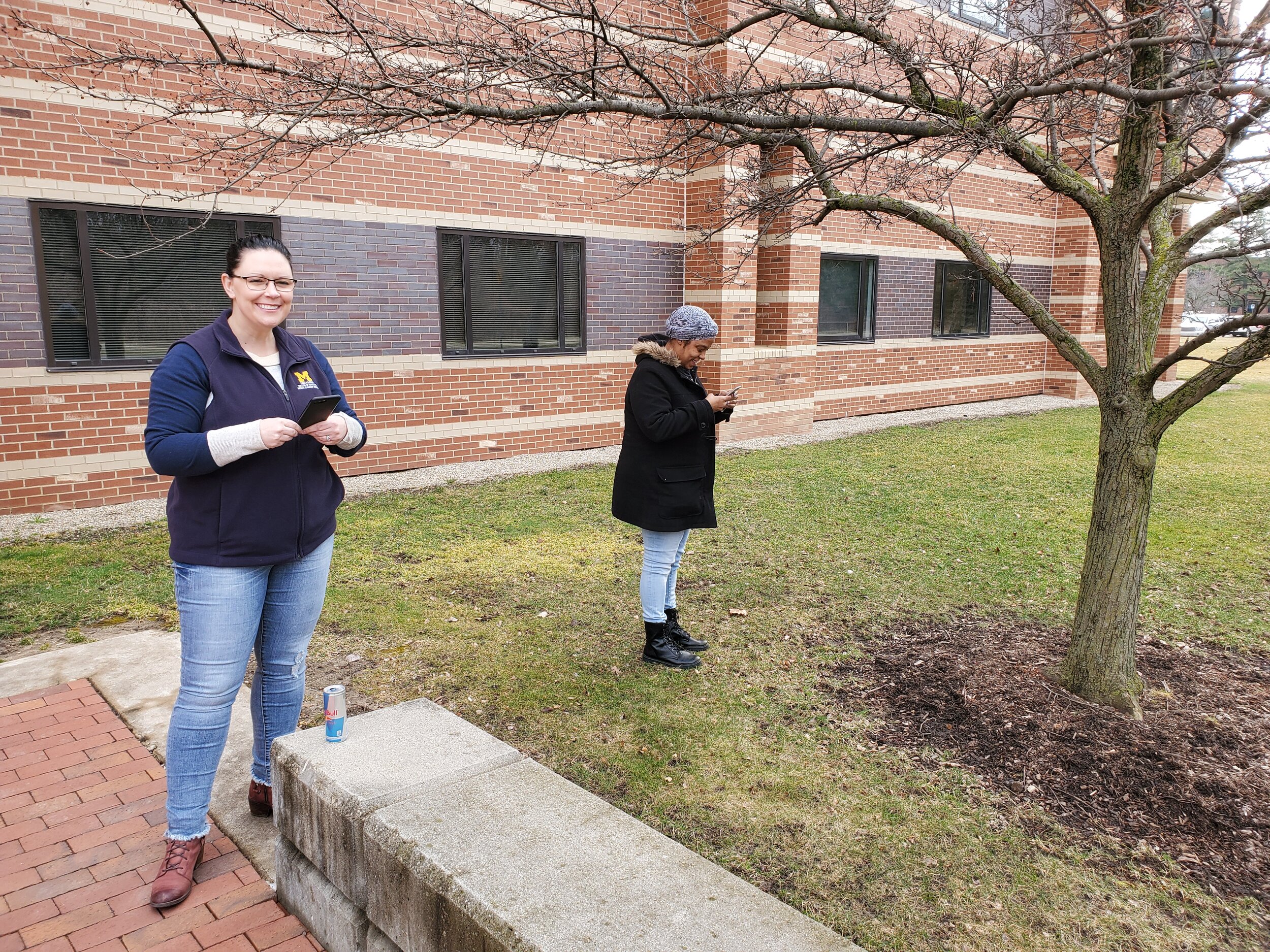 One of the most helpful components was a


 The presentation covered a basic introduction to the tools and workflow in CHM. The students were asked to use
 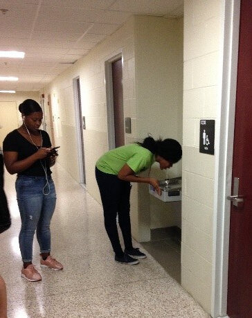 On their return, the students explored maps of their data points on Fulcrum. Many noted that the process of collecting data points was easy and fun. UMD Professor James Butler mentioned that although drinking a good amount of water is emphasized at the School of Public Health, he had not previously noticed that there is no water fountain near the faculty lounge. His comment underscored that issues are often not observed until actively examined, as during the mapping process.
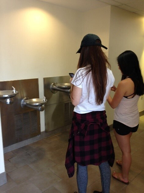 The class ended with Professor Butler concluding the class by reiterating how CHM can serve as a useful tool for visualizing many of the different health issues discussed in class.The students were alerted to the free new online
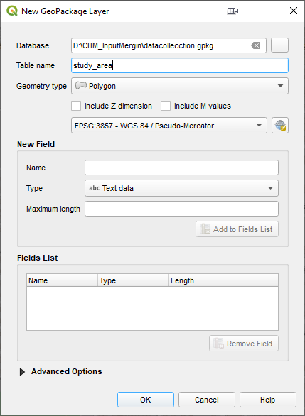
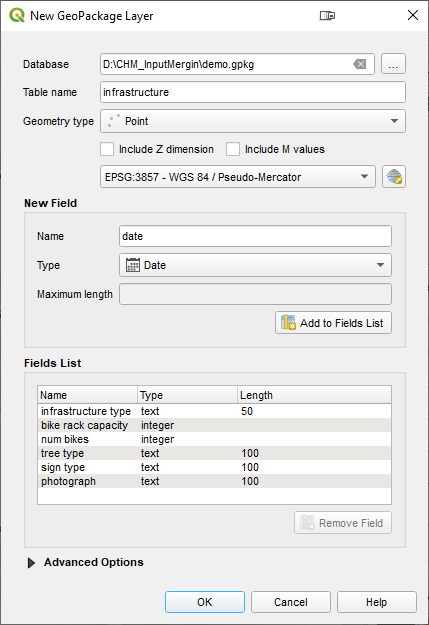
  Although QField is rooted in QGIS code it is not a miniature version of QGIS. Rather it is a streamlined data collection app. As they say, "the buttons are few and they are large," so you can work with it out in the field. QField lets you create a map in QGIS and upload that map to your mobile device. From there you can collect data.The workflow for QField looks like this. You begin by making a QGIS project on your computer. Importantly this project will contain the point, line or polygon layer(s) you want to populate in the field. (NOTE that Fulcrum only allows the collection of points!) This means you think of your survey form and data to be collected in the office, and create fields in your GIS layer(s) for each question you want to answer. With a little bit of QGIS editing familiarity this isn't any more difficult or time consuming than creating a form in Fulcrum. You then upload the folder containing the QGIS project and data to your mobile device. The
 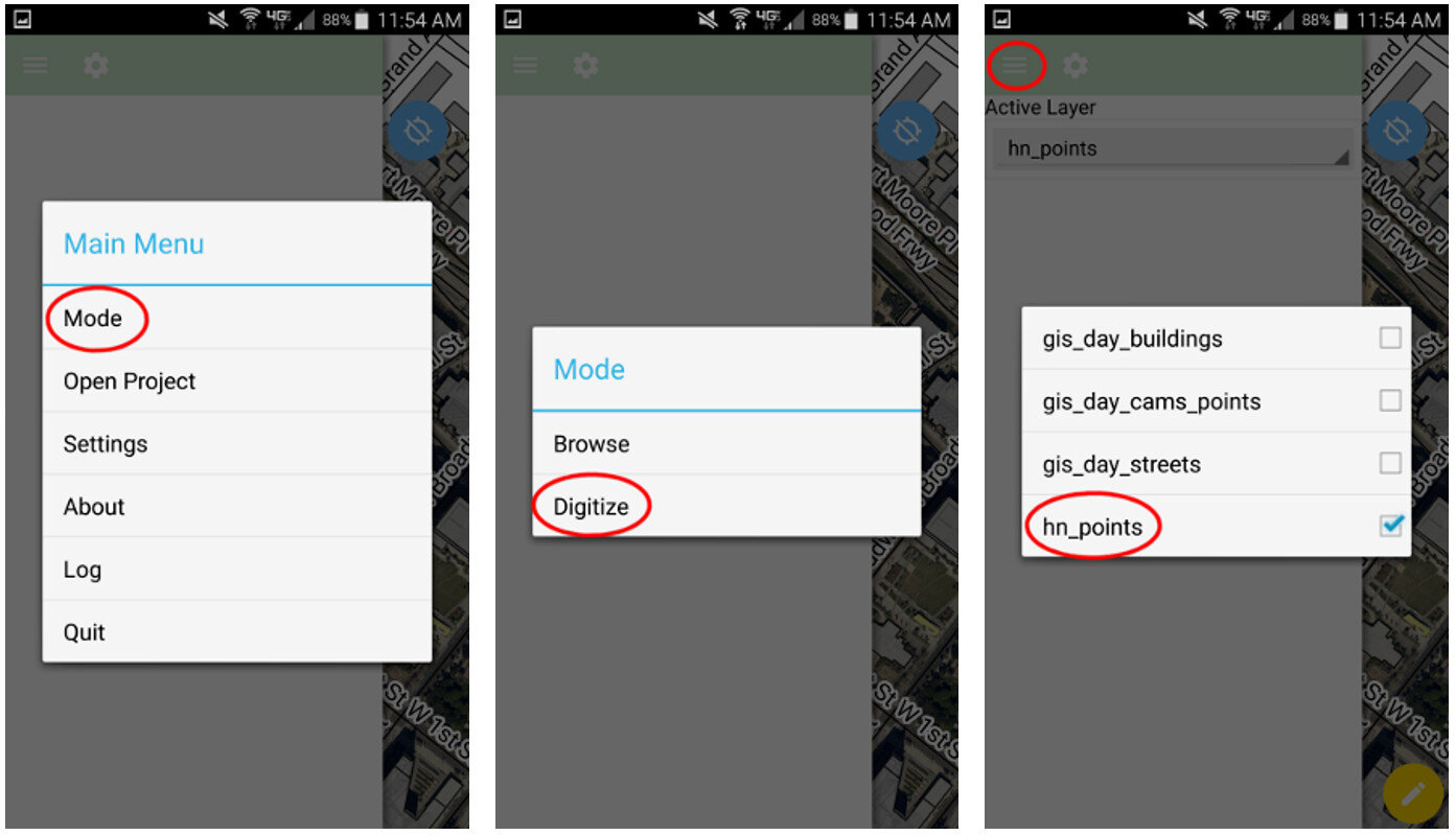 QField uses the same rendering engine as QGIS so the map will look identical to how it did in the office. Once the map is open you can select from one of two modes: Browse or Digitize. When collecting data you would choose Digitize. Then select the layer you want to work with.
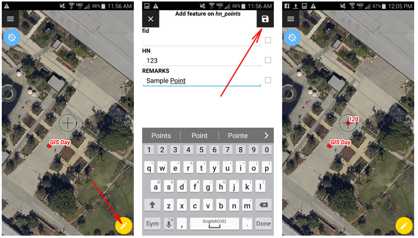 For public health officials with security concerns QField is a great fit because there is no third party cloud platform involved. The data is not being streamed across the internet. All the data is stored locally on your mobile device. You can simply use the My Files app on your device to navigate to your GeoPackage file and email it to yourself. If it is too large you can connect your device to you computer to download it or use a data sharing app such as DropBox or Google Drive.Since this is an open source project you can request new features and report any bugs you encounter by
  . To change the location I click the Edit Location button. Then I click on the map at the location where the point should be moved. To save my edits I click the green Accept edits button
  .
. I can also edit the attributes of a point. It is a similar process. First I click on the point I need to edit. Then I click the pencil icon. I scroll down to find the attribute I need to edit and make the change. Once done click the green check mark button to accept the changes.
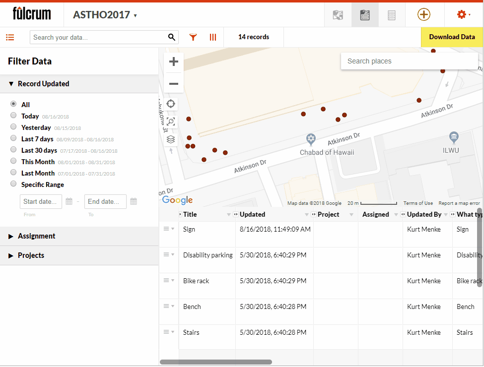 I can also add new points from this interface in Fulcrum. To do this I simply click the green Add point button
  and populate the attributes. If I have elements where were set to required in my App, I will have to populate them here, just as I did with my mobile device in the field.So if you have collected some data and realize it needs some correction you can do that directly in Fulcrum prior to downloading it. Also note that the data can also be edited in