CartoDB is an online cloud based platform for storing and visualizing spatial data. It is the perfect tool for the third part of the workflow (outlined in the Introduction). You can sign up for a free account, which gives you 50Mb of storage space. Data can be collected with a smart phone or tablet with iForm, and brought directly into CartoDB. It is a very intuitive platform. You can literally drag and drop a spreadsheet onto the CartoDB page and have the data upload to your account. It will accept the most common geospatial file formats including: spreadsheets and comma delimited text files with addresses or coordinates, KML/KMZ, GPX, and shapefiles. Below is an example of a spreadsheet of Baltimore Dialysis Centers in CartoDB. This shows the spreadsheet in Data View .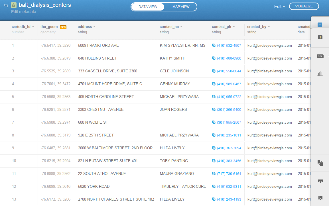 After telling CartoDB which columns contain the latitude and longitude values, the data can be viewed in Map View (below). Here the default Positron basemap is being used. There are a variety of basemaps to choose from including imagery, Stamen maps and Nokia maps.
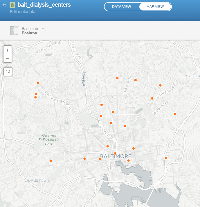 Once multiple data layers have been uploaded you can create a visualization. Below is a map focusing on Balitmore Diabetes. It includes Baltimore neighborhoods classified by the number of diabetics, food deserts and dialysis centers. CartoDB provides wizards and other tools for styling your data. The dynamic map can be accessed here: http://cdb.io/1G4xP7j
 Visualizations can be shared via hyperlinks and embedded into webpages. CartoDB also has great documentation including:
- CartoDB Editor Documentation
- A comprehensive series of tutorials breaking tasks up into Basic, Medium and Advanced categories
- Tips and Tricks
- FAQ’s
Sign up for a free account and take it for a spin. On a related note Community Health Maps is almost done with a complete curriculum for community health mapping. It consists of six labs. The final lab shows you how to work with CartoDB from setting up an account to sharing a visualization. Stay tuned!